Key Points:
- First Impressions Matter: Your website is your digital persona; make it professional and trustworthy.
- Credibility Is Currency: Use social proof to establish trust and authority.
- Universal Design: Make your website accessible to all, both for ethical reasons and to widen your client base.
- Usability and Content: A user-friendly interface and compelling content are your secret weapons for conversion.
The Six Cardinal Sins of Law Firm Websites: How to Turn Web Traffic into Real, Billable Hours 🚀
Hold your horses, future Alan Dershowitzes and Ruth Bader Ginsburgs! Before you make another phone call to your IT guy complaining about low conversion rates, listen up. There’s no point in being the King or Queen of SEO if your website isn’t converting looky-loos into paying, gavel-smashing clients. So grab your powdered wigs and your legal pads—this is the controversial, sensational, and divisive exposé your law firm’s website absolutely needs.
Table of Contents:
- Dress for Success: Web Design as Your Digital Three-Piece Suit
- The Court of Public Opinion: Build Credibility or Perish
- The Law Is for Everyone: Making Your Website Accessible
- The “Objection, Your Honor!” of Websites: Usability
- Content: Don’t Just Be the Lawyer; Be the Law
- A Direct Line to the Judge: The Conversion Path
- Why Should You Care?
1. Dress for Success: Web Design as Your Digital Three-Piece Suit 👔
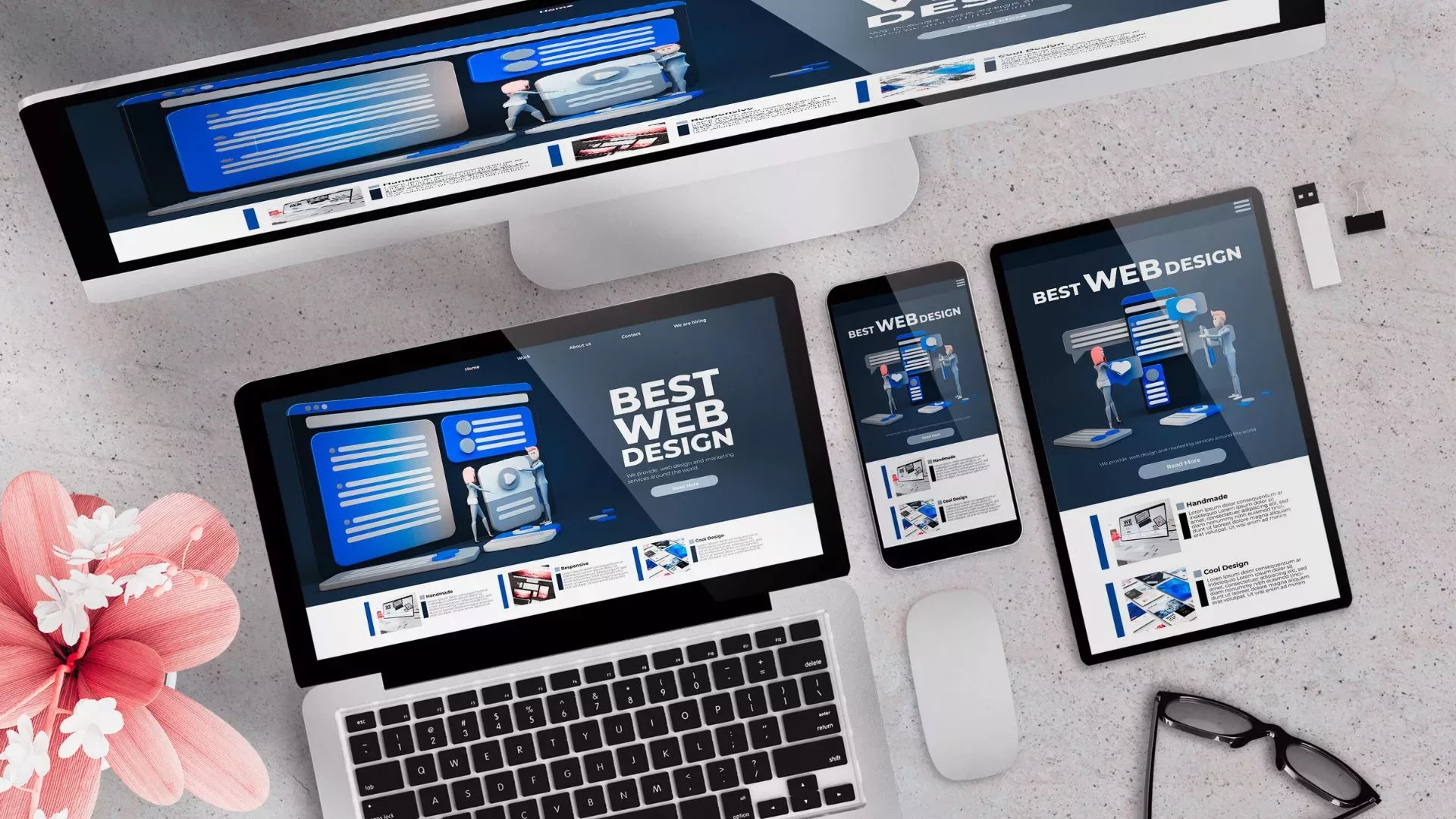
Would you strut into the courtroom wearing Crocs and a SpongeBob t-shirt? If the answer is “yes,” maybe stick to traffic court. Your website is your digital attire—it must make you look good, or you’re toast. An ugly, outdated website is the 21st-century equivalent of a disheveled lawyer: no one wants to hire them.
Key Points:
Contrasting Colors: Utilize contrasting colors for calls to action like “Free Consultation.” It’s the virtual equivalent of shouting “Objection, your Honor!”
First Impressions: Just like you wouldn’t show up in court without brushing your hair, make sure your attorney photos create an air of trust.
2.The Court of Public Opinion: Build Credibility or Perish 📚
If you wouldn’t hire a contractor without checking their Yelp reviews, why should a client take a chance on your law firm without some form of social proof?
Ways to Flex your Legal Muscles:
Badges of Honor: Showcase awards, membership badges, or even a participation trophy from that case you almost won.
Client Reviews: They’re like the legal world’s version of Rotten Tomatoes.
3. The Law Is for Everyone: Making Your Website Accessible ♿️
Would you turn away a client because they couldn’t climb stairs to your office? Of course not. So why would your website do that digitally?
Three Words: Web Accessibility Standards
ADA Standards: If you ignore this, not only are you missing out on potential clients, you’re basically inviting a lawsuit. How ironic!
WCAG 2.1 AA: This is not a new Star Wars droid. It’s the standard for making your website accessible.
4. The “Objection, Your Honor!” of Websites: Usability 🖱
Your website must be as sharp and effective as a seasoned lawyer grilling a shaky witness. From navigation bars to the user journey, everything must flow.
Pain Points:
Core Web Vitals: Google doesn’t just care about what you’re saying; they care about how quickly you’re saying it. Accelerated Mobile Pages (AMP) can be your saving grace here.
Content: Don’t Just Be the Lawyer; Be the Law 📝
You know what makes John Grisham’s legal thrillers sell? It’s not just the story; it’s the writing. Your content should capture interest, solve problems, and force Google to pay attention to you.
The Golden Rule:
Originality and Relevance: Make sure your content isn’t just fluff or filled with legalese that only a robot could love.
A Direct Line to the Judge: The Conversion Path 📞
How easy is it for a client to reach you? If your website is a maze, you’re more likely to repel clients than attract them.
Final Tips:
Multiple Avenues: Offer email, phone, and live chat options. Let’s be honest: nobody wants to fill out a ‘Contact Us’ form and wait three business days for a reply.
Why Should You Care? 🎯
Folks, a law firm’s website is its battlefield, its stage, and its first impression. Get it right, and you’re Clarence Darrow. Get it wrong, and you’re… well, let’s not go there.
The Gavel Has Spoken! 🤯👨⚖️👩⚖️
Feeling the heat? Want more sizzling, fiery, thought-provoking legal trends straight to your inbox? Sign up for our newsletter! Until then, let the virtual litigations begin! 📧🔥
Raise your game, your gavel, and your conversion rates all at once. What more could a modern lawyer want? 🌟
Share this post
Frequently Asked Questions (FAQs)
Q: Why should I care about website design?
A: Your website is your digital first impression. A poorly designed site can turn off potential clients before they even speak to you.
Q: What is social proof and how can it help?
A: Social proof includes client reviews and accolades that instill trust. Think of it as the Yelp of law firms—people want to go with a 5-star lawyer.
Q: Why does my website need to be accessible?
A: ADA compliance isn’t just ethical, it’s legal. You could be inviting lawsuits if your site isn’t accessible to everyone.
Q: What is the importance of usability?
A: If your site is confusing, people will leave. Period. Good usability means a smooth user journey from landing page to contact form.
Q: What type of content should I feature?
A: Content should be original, informative, and engaging. Think of it as John Grisham meets Harvard Law Review.


